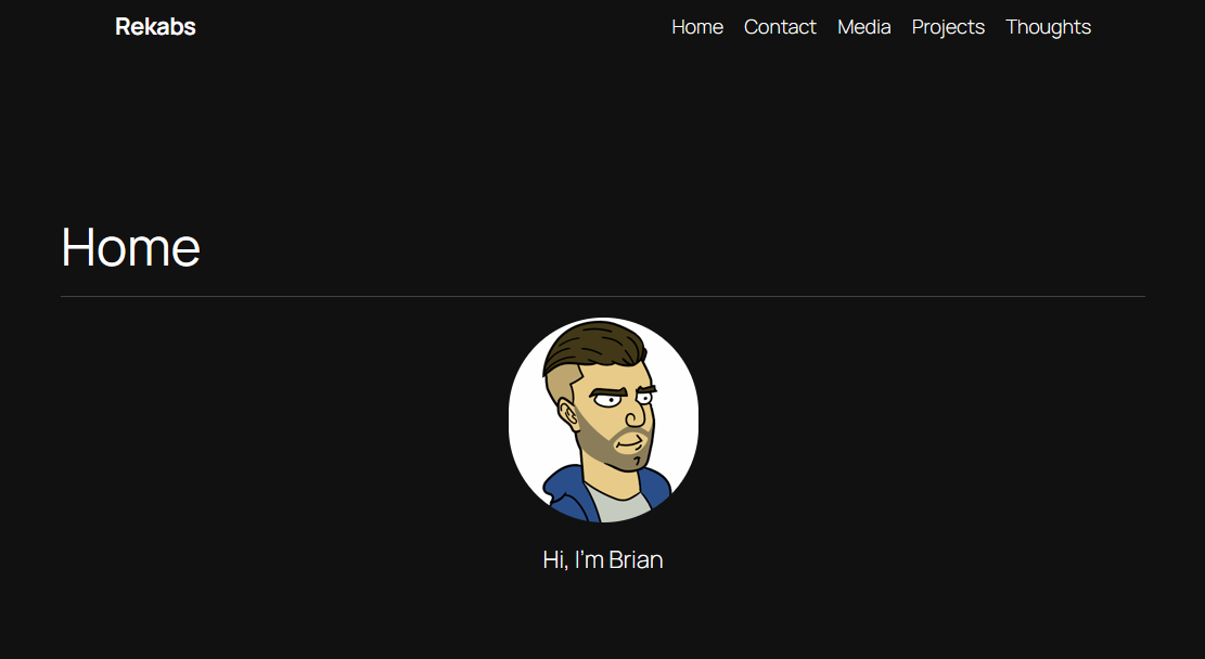
Rekabs.com started the same way most projects do: with a rough sketch, a handful of ideas, and a desire to make something clean, functional, and honest. I wanted a place to document builds without the clutter and noise that usually comes with personal websites—a space where the work could speak for itself. The design grew around that idea.
The site’s layout is intentionally simple. Each project gets room to breathe, with large images, straightforward text, and no extra decoration. The typography is minimal and quiet, chosen to stay out of the way of the photos. Navigation works the same way: quick, clear, and predictable, like a well-designed jig in the shop. You should always know where you are and what comes next.
Building the structure of the site felt a lot like building furniture. Pages were roughed out, refined, and fitted together. Some ideas didn’t make the final cut, others were reshaped, and a few unexpected solutions came from experimenting along the way. The goal wasn’t to pack the site with features—it was to build something sturdy and clean that could grow naturally as more projects are added.
No stock imagery, no artificial shine—just the projects and the process. Each post follows the same philosophy: simple descriptions, honest explanations, and attention to the details that make each build unique.
Rekabs.com became exactly what it needed to be: a home for documenting builds, sharing experiments, and keeping track of the maker journey. It’s a project that will keep evolving.
